Components
Components are the most basic user interface building block of an Angular application. An angular application contains a tree of angular components.
It is a subset of directives and always associated with a template. Unlike other directives, you can only create one instance of a component per element in a template.
A component is nothing more than a simple TypeScript class in which you can create your own methods and properties according to your needs, which is used to bind with a UI (HTML page or cshtml page) of our application.
The most important feature of any Angular application is the component that controls View or the template that we use. In general, we write all the application logic for the view that is assigned to this component.
Therefore, an Angular application is just a tree of such Components, when each Component is processed, it recursively processes its children Components. At the root of this tree is the top level component, the main component.
When we bootstrap an Angular application, we tell the browser to render that top level root Component which renders its child component and so on.
Let’s see the AppComponent code snippet in the application.
app.component.ts
import { Component } from '@angular/core';

@Component({
  selector: 'app-root',
  templateUrl: './app.component.html',
  styleUrls: ['./app.component.css']
})
export class AppComponent {
  title = 'app';
}
Let's take a look at each of these 3 definition sections in detail.
1. Component Imports
import { Component } from '@angular/core';
The way you make a class component is by importing the component member from the @angle / core library: some components may have dozens of imports based on the component's needs.
2. The Component Decorator
@Component({
  selector: 'app-root',
  templateUrl: './app.component.html',
  styleUrls: ['./app.component.css']
})
The next section is what is known as a component decorator. The @Component is using the component that was imported from the above import line. This is what makes this class a component.
Within the component, it has a variety of configuration properties that help define this component.
• selector: this is the name of the label to which the component is applied. For example: <app-root> Loading ... </ app-root> in index.html.
• templateUrl & styleUrls:these define the HTML template and style sheets associated with this component. You can also use the template and style properties to define inline HTML and CSS.
There are other properties that can be defined within the component decorator based on the component's needs. We will see in the next chapter.
3. The Component Class
export class AppComponent {
  title = 'app';
}
Lastly, we have the core of the component, that is the component class.
This is where the various properties and methods are defined. All properties and methods defined here are accessible from the template. Likewise, events occurring in the template are accessible within the component.
Become a component when we add @Component metadata or we can say that when you decorate the simple class with the @Component attribute, it becomes the component.
To make this class an angular component, we need to decorate the above class using the @Component decorator that is present in the @ angular / core library. That's why we have to import @ angular/core even using the following piece of code.
import { Component } from '@angular/core';
Note: The normal TypeScript class will become a component class once decorated with @component decorator.
Finally, a component must belong to an NgModule to be available for another component or application. To specify that a component is a member of an NgModule, it must be included in the declaration field of that @NgModulemetadata (NgModule).
When we created a new project using the angular-cli command, the above files were created by default.
The file structure has the application component and consists of the following files-
- app.component.css
- app.component.html
- app.component.spec.ts
- app.component.ts
- app.module.ts
If you open the app.module.ts file, you have some imported libraries and also a declarative to which the Appcomponent is assigned in the following way:
app.module.ts
import { BrowserModule } from '@angular/platform-browser';
import { NgModule } from '@angular/core';

import { AppComponent } from './app.component';

@NgModule({
  declarations: [
    AppComponent
  ],
  imports: [
    BrowserModule
  ],
  providers: [],
  bootstrap: [AppComponent]
})
export class AppModule { }
As per above code the declarations include the AppComponent variable, which we have already imported. This becomes the parent component.
Now, angular-cli has a command to create your component. However, the app component that is created by default will always remain the parent component and the next components created will form the child components. Let’s create your corner component.
create a components using the following command in the integrated terminal:
ng g c demo
• ng calls the angular CLI
• g is the abbreviation of generate (note, you can use the whole word generate if you wish)
• c is the abbreviation of component (note, you can use the whole word component if you wish). component is the type of element that is going to be generated (others include directive, pipeline, service, class, security, interface, enumeration and module)
• and then the name of the component
When you run the above command on the command line, you will receive the following output:
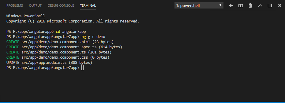
Now, if we check the structure of the file, we will get the new demo folder created in the src/app folder.
The following files are created in the demo folder:
• demo.component.css: the css file is created for the new component.
• demo.component.html: the html file was created.
• demo.component.spec.ts: can be used for unit tests.
• demo.component.ts: here we can define the module, properties, etc.
The changes are added to the app.module.ts file as follows:
app.module.ts
import { BrowserModule } from '@angular/platform-browser';
import { NgModule } from '@angular/core';

import { AppComponent } from './app.component';
import { DemoComponent } from './demo/demo.component'; // includes the demo component we created

@NgModule({
  declarations: [
    AppComponent,
    DemoComponent // here it is added in declarations and will behave as a child component
  ],
  imports: [
    BrowserModule
  ],
  providers: [],
  bootstrap: [AppComponent] //for bootstrap the AppComponent the main app component is given.
})
export class AppModule { }
The demo.component.ts file is generated as follows −
app.module.ts
import { Component, OnInit } from '@angular/core';

@Component({
  selector: 'app-demo',
  templateUrl: './demo.component.html',
  styleUrls: ['./demo.component.css']
})
export class DemoComponent implements OnInit {

  constructor() { }

  ngOnInit() {
  }

}
If you see the above demo.component.ts file, it create a new class called DemoComponent, which implements OnInit.In, which has a constructor and a method called ngOnInit (). ngOnInit is called by default whenever the class is run.
Let's see how the flow works. As you already know, the app component, which is created by default, becomes the main component. Any component added later becomes the child component.
When we click on the URL on http: // localhost:4200/ browser, first run the index.html file shown below:
index.html
<!doctype html>
<html lang="en">
<head>
 <meta charset="utf-8">
  <title>MyApp</title>
  <base href="/">

  <meta name="viewport" content="width=device-width, initial-scale=1">
  <link rel="icon" type="image/x-icon" href="favicon.ico">
</head>
<body>
 <app-root></app-root>
</body>
</html>
The above is the normal html file and we do not see anything printed in the browser. Let’s see at the tag in the body section.
<app-root></app-root>
This is the root tag created by Angular by default. This tag has the reference in the main.ts file in your application.
main.ts
import { enableProdMode } from '@angular/core';
import { platformBrowserDynamic } from '@angular/platform-browser-dynamic';

import { AppModule } from './app/app.module';
import { environment } from './environments/environment';

if (environment.production) {
  enableProdMode();
}

platformBrowserDynamic().bootstrapModule(AppModule)
  .catch(err => console.log(err));
AppModule is imported from the app of the main parent module and the same is given to the bootstrap module, which loads the application module.
Now let's see the file app.module.ts -
AppModule
import { BrowserModule } from '@angular/platform-browser';
import { NgModule } from '@angular/core';

import { AppComponent } from './app.component';
import { DemoComponent } from './demo/demo.component';

@NgModule({
  declarations: [
    AppComponent,
    DemoComponent
  ],
  imports: [
    BrowserModule
  ],
  providers: [],
  bootstrap: [AppComponent]
})
export class AppModule { }
Here, AppComponent is the specified name, which is the variable to store the reference of the app. Component.ts and the same is specified to the bootstrap. Now let's see the file app.component.ts.
app.component.ts
import { Component } from '@angular/core';

@Component({
  selector: 'app-root',
  templateUrl: './app.component.html',
  styleUrls: ['./app.component.css']
})
export class AppComponent {
  title = 'app';
}
The angular core is imported and is known as Component and is used in the Declarer as
@Component({
  selector: 'app-root',
  templateUrl: './app.component.html',
  styleUrls: ['./app.component.css']
})
In the declarator reference to the selector, templateUrl and styleUrl are supplied. The selector here is no more than the tag that was inserted in the index.html file we saw above.
The AppComponent class has a variable called title, which is displayed in the browser.
@Component uses the templateUrl called app.component.html, which is the following:
app.component.html
<div style="text-align:center">
  <h1>
    Welcome to {{ title }}!
  </h1>
  <img width="300" alt="Angular Logo" src="data:image/svg+xml;base64,PHN2ZyB4bWxucz0iaHR0cDovL3d3dy53My5vcmcvMjAwMC9zdmciIHZpZXdCb3g9IjAgMCAyNTAgMjUwIj4KICAgIDxwYXRoIGZpbGw9IiNERDAwMzEiIGQ9Ik0xMjUgMzBMMzEuOSA2My4ybDE0LjIgMTIzLjFMMTI1IDIzMGw3OC45LTQzLjcgMTQuMi0xMjMuMXoiIC8+CiAgICA8cGF0aCBmaWxsPSIjQzMwMDJGIiBkPSJNMTI1IDMwdjIyLjItLjFWMjMwbDc4LjktNDMuNyAxNC4yLTEyMy4xTDEyNSAzMHoiIC8+CiAgICA8cGF0aCAgZmlsbD0iI0ZGRkZGRiIgZD0iTTEyNSA1Mi4xTDY2LjggMTgyLjZoMjEuN2wxMS43LTI5LjJoNDkuNGwxMS43IDI5LjJIMTgzTDEyNSA1Mi4xem0xNyA4My4zaC0zNGwxNy00MC45IDE3IDQwLjl6IiAvPgogIDwvc3ZnPg==">
</div>
<h2>Here are some links to help you start: </h2>
<ul>
 <li>
    <h2><a target="_blank" rel="noopener" href="https://angular.io/tutorial">Tour of Heroes</a></h2>
  </li>
  <li>
    <h2><a target="_blank" rel="noopener" href="https://github.com/angular/angular-cli/wiki">CLI Documentation</a></h2>
  </li>
  <li>
   <h2><a target="_blank" rel="noopener" href="https://blog.angular.io/">Angular blog</a></h2>
  </li>
</ul>
It has only the html code and the variable title in brackets. It is replaced with the value, which is present in the app.component.ts file. This is called binding. We will learn the concept of binding in a later chapter.
Now that we have created a new component that is new-cmp. The same is included in the app.module.ts file, when the command is executed to create a new component.
app.module.ts has a reference to the every new component created.
Now let's see the new files created in the demo.
demo.component.ts
import { Component, OnInit } from '@angular/core';

@Component({
  selector: 'app-demo',
  templateUrl: './demo.component.html',
  styleUrls: ['./demo.component.css']
})
export class DemoComponent implements OnInit {

  constructor() { }

  ngOnInit() {
  }

}
Here, we must also import the core. The component reference is used in the declarator.
The declarator has the selector called app-demo and templateUrl and styleUrl.
The .html called demo.component.html is as follows:
demo.component.html
<p>
  demo works!
</p>
As we saw above, we have the html code, ie the p tag. The style file is empty because we do not need a style at the moment. But when we run the project, we do not see anything related to the new component that is displayed in the browser. Now add something or change something and the same can be seen in the browser later.
The selector, which is the app-demo must be added in the app.component.html file as follows:
app.component.html
<div style="text-align:center">
<h1>
Welcome to {{ title }}!
</h1>
<img width="300" alt="Angular Logo" src="data:image/svg+xml;base64,PHN2ZyB4bWxucz0iaHR0cDovL3d3dy53My5vcmcvMjAwMC9zdmciIHZpZXdCb3g9IjAgMCAyNTAgMjUwIj4KICAgIDxwYXRoIGZpbGw9IiNERDAwMzEiIGQ9Ik0xMjUgMzBMMzEuOSA2My4ybDE0LjIgMTIzLjFMMTI1IDIzMGw3OC45LTQzLjcgMTQuMi0xMjMuMXoiIC8+CiAgICA8cGF0aCBmaWxsPSIjQzMwMDJGIiBkPSJNMTI1IDMwdjIyLjItLjFWMjMwbDc4LjktNDMuNyAxNC4yLTEyMy4xTDEyNSAzMHoiIC8+CiAgICA8cGF0aCAgZmlsbD0iI0ZGRkZGRiIgZD0iTTEyNSA1Mi4xTDY2LjggMTgyLjZoMjEuN2wxMS43LTI5LjJoNDkuNGwxMS43IDI5LjJIMTgzTDEyNSA1Mi4xem0xNyA4My4zaC0zNGwxNy00MC45IDE3IDQwLjl6IiAvPgogIDwvc3ZnPg==">
</div>
<h2>Here are some links to help you start: </h2>
<ul>
<li>
<h2><a target="_blank" rel="noopener" href="https://angular.io/tutorial">Tour of Heroes</a></h2>
</li>
<li>
<h2><a target="_blank" rel="noopener" href="https://github.com/angular/angular-cli/wiki">CLI Documentation</a></h2>
</li>
<li>
<h2><a target="_blank" rel="noopener" href="https://blog.angular.io/">Angular blog</a></h2>
</li>
</ul>
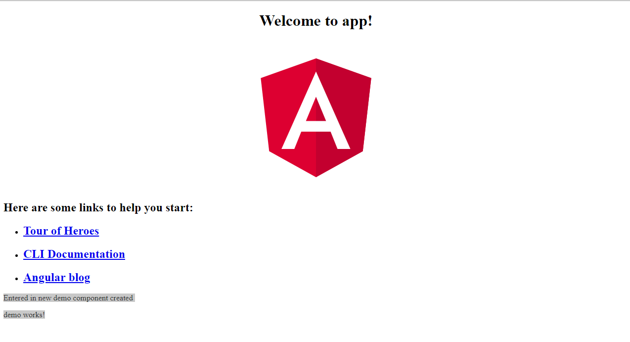
<app-demo></app-demo>
When the <app-demo> </app-demo> tag is added, everything in the .html file of the newly created component will be displayed in the browser along with the parent component data.
Let's see the newcomponent.html file and the new-cmp.component.ts file.
demo.component.ts
import { Component, OnInit } from '@angular/core';

@Component({
  selector: 'app-demo',
  templateUrl: './demo.component.html',
  styleUrls: ['./demo.component.css']
})
export class DemoComponent implements OnInit {
   newcomponent = "Entered in new demo component created";
  constructor() { }

  ngOnInit() {
  }

}
In the class, we have added a variable called a new component and the value is "Inserted in the newly created component".
The above variable is bind in the .demo.component.html file as follows:
demo.component.html
<p>
  {{newcomponent}}
</p>

<p>
  demo works!
</p>
Now, since we have included the <app-demo> </app-demo> selector in the app.component.html which is the html of the parent component, the content in the new component .html file (demo.component.html) is displayed in the browser as follows:
Likewise, we can create components and link them using the selector in the app.component.html file based on our requirements.